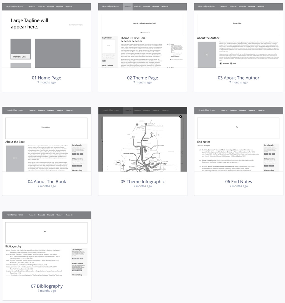
Look Development
"How to Fly A Horse" relies heavily on 19th and 20th century history to support it’s thesis that anyone can create. Drawing from images of the real events that happened, as well as similar imagery from that time period, created a
rich visual atmosphere and helped make the stories feel more authentic and relatable.
First Mockups - A Stab in the Dark
These first mockups were initially created for Barnes & Noble sales group with little planning other than look
development (above). They became useful for later discussions that included: which functions to keep, and which
functions to remove, and/or change.
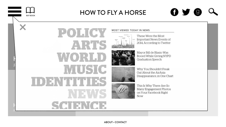
Hamburger Icons - Too Complex
Author Kevin Ashton promoted using the navigation styles found on qz.com, particularly "hamburger" menus on the
large screen version of the website. Doing some quick research showed that hamburger menus are not widely
understood by all audiences yet, so a compromise was reached to use hamburger menus only on mobile.
http://techcrunch.com/2014/05/24/before-the-hamburger-button-kills-you/
http://www.theatlantic.com/product/archive/2014/08/the-hamburger-menu-debate/379145/
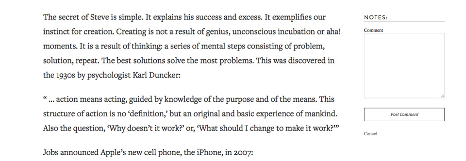
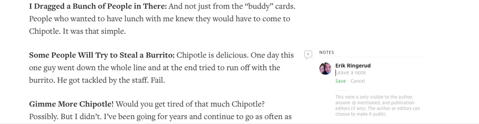
Inline Comments - An Experiment
Author Kevin Ashton also promoted using inline comments/notes in a style similar to Medium.com. Because
Medium.com is one of the few sites that support this functionality, is seemed reasonable that it would not be
widely understood. A decision was reached that because they are not obtrusive, and comments at the bottom
of the page would persist, the inline comments would not be harmful to the site. To date, there has been 0%
usage of inline comments on the site, and dozens of footer comments.
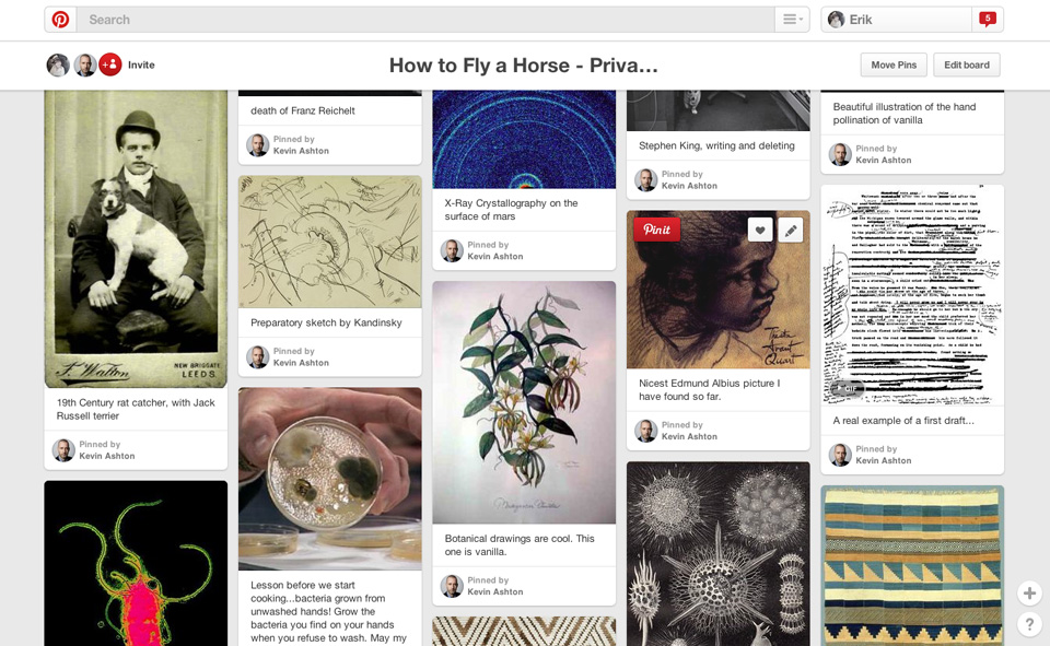
Social Media Plan
Given the limited budget from publisher Random House for advertisement, it was determined that social media as
well as placing excerpts from the book on sites such as Medium.com, would be an effective way to bring in traffic,
engage new readers, promote the book, and give opportunity for social sharing for others to discover the book.
This plan has been successful (see analytics below).
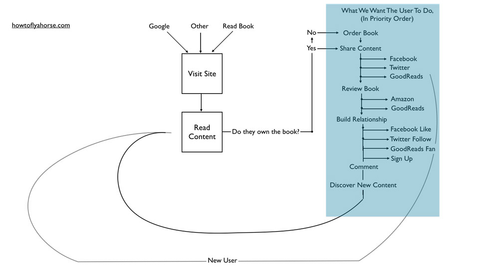
Clickable Wireframes
Clickable wireframes were created based on the above stages. This stage helped to refine the experience
and inform the decision to make the homepage like a magazine, to maximize engagement for the likely smaller
number of visitors that would come to the site first through the homepage.
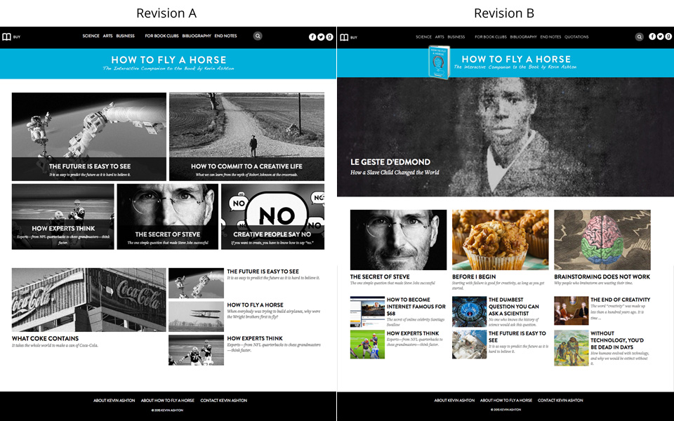
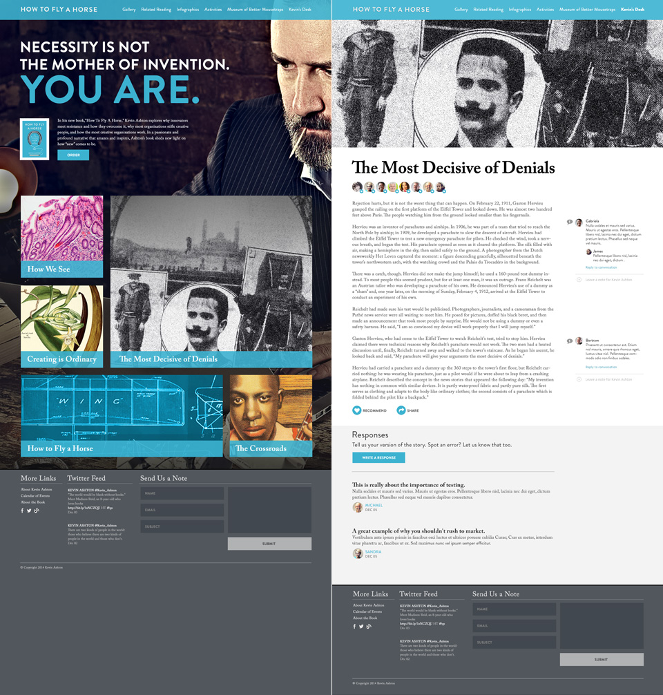
Final Mockups
Final mockups were created based on all the contributing steps above. Left is a first version, which evolved to the
version on the right. The version on the right is thought to have a more structured hierarchy of information with 3
distinct article sizes, and is more visually enticing to click, given that it is full color.
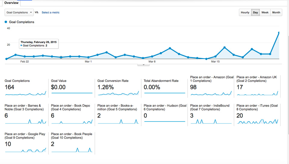
Analytics / Analysis
The above screenshot is from Google Analytics. Goals were defined as clicking on a link to purchase a book from
one of the various possible vendors. For a period of time the site was averaging a conversion rate of 1.26% of ALL visitors clicking on a link to purchase a book. The conversion rate of 1.26% was many times higher than expected and was attributed to
very targeted traffic coming to the site, strong content engagement, and ease of purchase.
 Howtoflyahorse.com